Whisky flavor profiles revisited
Published: 2025-05-02 11:30AM
|
Let’s take a first look at Underdog and Matrix, two new Groovy-powered dataframe libraries. We’ll explore Whisky flavor profiles! |
In previous blog posts, we have looked at clustering whisky profiles using:
-
Apache Wayang’s cross-platform machine learning supporting native and Apache Spark™ data processing platforms
The groovy-data-science repo also has examples of this case study using other technologies including:
-
Data manipulation: Tablesaw, Datumbox, Apache Commons CSV, Tribuo
-
Clustering: Smile, Apache Commons Math, Datumbox, Weka, Encog, Elki, Tribuo
-
Visualization: XChart, Tablesaw Plot.ly, Smile visualization, JFreeChart
-
Scaling clustering: Apache Ignite, Apache Spark, Apache Wayang, Apache Flink, Apache Beam
The Case Study
 In the quest to find the perfect single-malt Scotch whisky,
the whiskies produced from
86 distilleries
have been ranked by expert tasters according to 12 criteria
(Body, Sweetness, Malty, Smoky, Fruity, etc.).
We’ll use algorithms, like KMeans, to cluster the whiskies
into related groups.
In the quest to find the perfect single-malt Scotch whisky,
the whiskies produced from
86 distilleries
have been ranked by expert tasters according to 12 criteria
(Body, Sweetness, Malty, Smoky, Fruity, etc.).
We’ll use algorithms, like KMeans, to cluster the whiskies
into related groups.
A first look at Underdog
A relatively new data science library is Underdog. Let’s use it to explore Whisky profiles. It has many Groovy-powered features delivering a very expressive developer experience.
Underdog has the following modules: underdog-dataframe, underdog-graphs, underdog-plots, underdog-ml, and underdog-ta. We’ll use all but the last of these.
Underdog sits on top of some well-known data-science libraries in the JVM ecosystem like Smile, Tablesaw, and Apache ECharts. If you have used any of those libraries, you’ll recognise parts of the functionality shining through.
First, we’ll load our CSV file into an Underdog dataframe (removing a column we don’t need):
def file = getClass().getResource('whisky.csv').file
def df = Underdog.df().read_csv(file).drop('RowID')
Let’s look at the shape of and schema for the data:
println df.shape()
println df.schema()
It gives this output:
86 rows X 13 cols
         Structure of whisky.csv
 Index  |  Column Name  |  Column Type  |
-----------------------------------------
     0  |   Distillery  |       STRING  |
     1  |         Body  |      INTEGER  |
     2  |    Sweetness  |      INTEGER  |
     3  |        Smoky  |      INTEGER  |
     4  |    Medicinal  |      INTEGER  |
     5  |      Tobacco  |      INTEGER  |
     6  |        Honey  |      INTEGER  |
     7  |        Spicy  |      INTEGER  |
     8  |        Winey  |      INTEGER  |
     9  |        Nutty  |      INTEGER  |
    10  |        Malty  |      INTEGER  |
    11  |       Fruity  |      INTEGER  |
    12  |       Floral  |      INTEGER  |
When data has many dimensions, understanding the relationship between the columns can be hard. We can look at a correlation matrix to help us understand whether there is any redundant data, e.g. are Sweetness and Honey, or Tobacco and Smoky, two measure of the same thing or different things.
Underdog has a built-in plot for this, so let’s gather the numeric features and plot the correlation matrix:
def plot = Underdog.plots()
def features = df.columns - 'Distillery'
plot.correlationMatrix(df[features]).show()
Which has this output:
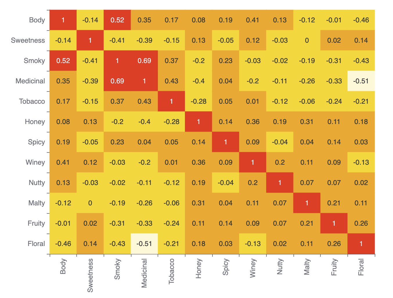
We can see that the different flavor measures are quite distinct. The highest correlations are between Smoky and Medicinal, and Smoky and Body. Some, like Floral and Medicinal, are very unrelated.
Groovy has a flexible syntax. Underdog has used this to piggyback on Groovy’s list notation allowing column expressions for filtering data within a dataframe. Let’s use column expressions to find whiskies of a particular flavor, in this case profiles that are somewhat fruity and somewhat sweet in flavor.
def selected = df[df['Fruity'] > 2 & df['Sweetness'] > 2]
println selected.shape()
We can see that there are 6 such whiskies:
6 rows X 13 cols
Let’s have a look at the flavor profiles as a radar plot.
The underdog-plots module has shortcuts making it easy to access the Apache ECharts library.
There is one such shortcut for a radar plot of a single series. Let’s look at row 0 of our selected whiskies:
plot.radar(
    features,
    [4] * features.size(),
    selected[features].toList()[0],
    selected['Distillery'][0]
).show()
Which has this output:
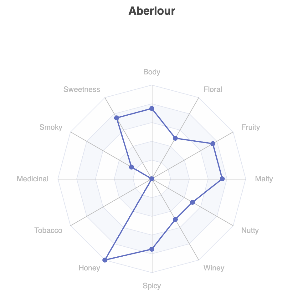
This pops up in a browser window for the code shown above, but other output options are also available.
This shows one of our 6 selected whiskies of interest. We could certainly do 5 other similar plots. The library (currently) doesn’t have a pre-built chart with multiple series all displayed together, but the library is built in a fairly flexible manner, and we can reach down one layer and build such a chart ourselves with not too much work:
def multiRadar = Chart.createGridOptions('Whisky flavor profiles',
    'Somewhat sweet, somewhat fruity') +
create {
    radar {
        radius('50%')
        indicator(features.zip([4] * features.size())
            .collect { n, mx -> [name: n, max: mx] })
    }
    selected.toList().each { row ->
        series(RadarSeries) {
            data([[name: row[0], value: row[1..-1]]])
        }
    }
}.customize {
    legend {
        show(true)
    }
}
plot.show(multiRadar)
Which has this output:
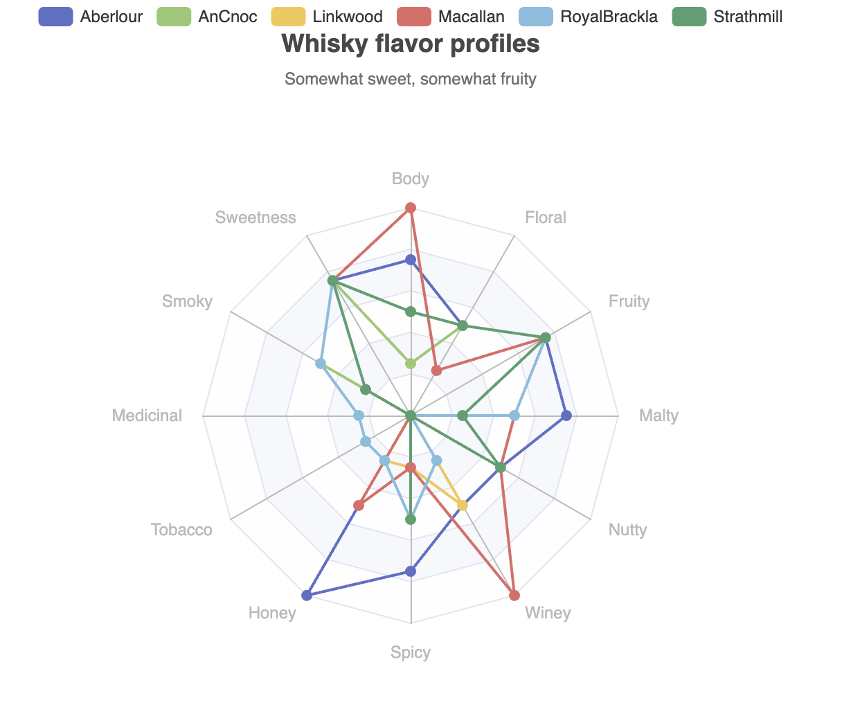
It can often be infuriating when a library doesn’t offer a feature you need, so it’s great that we can add such a feature on the fly!
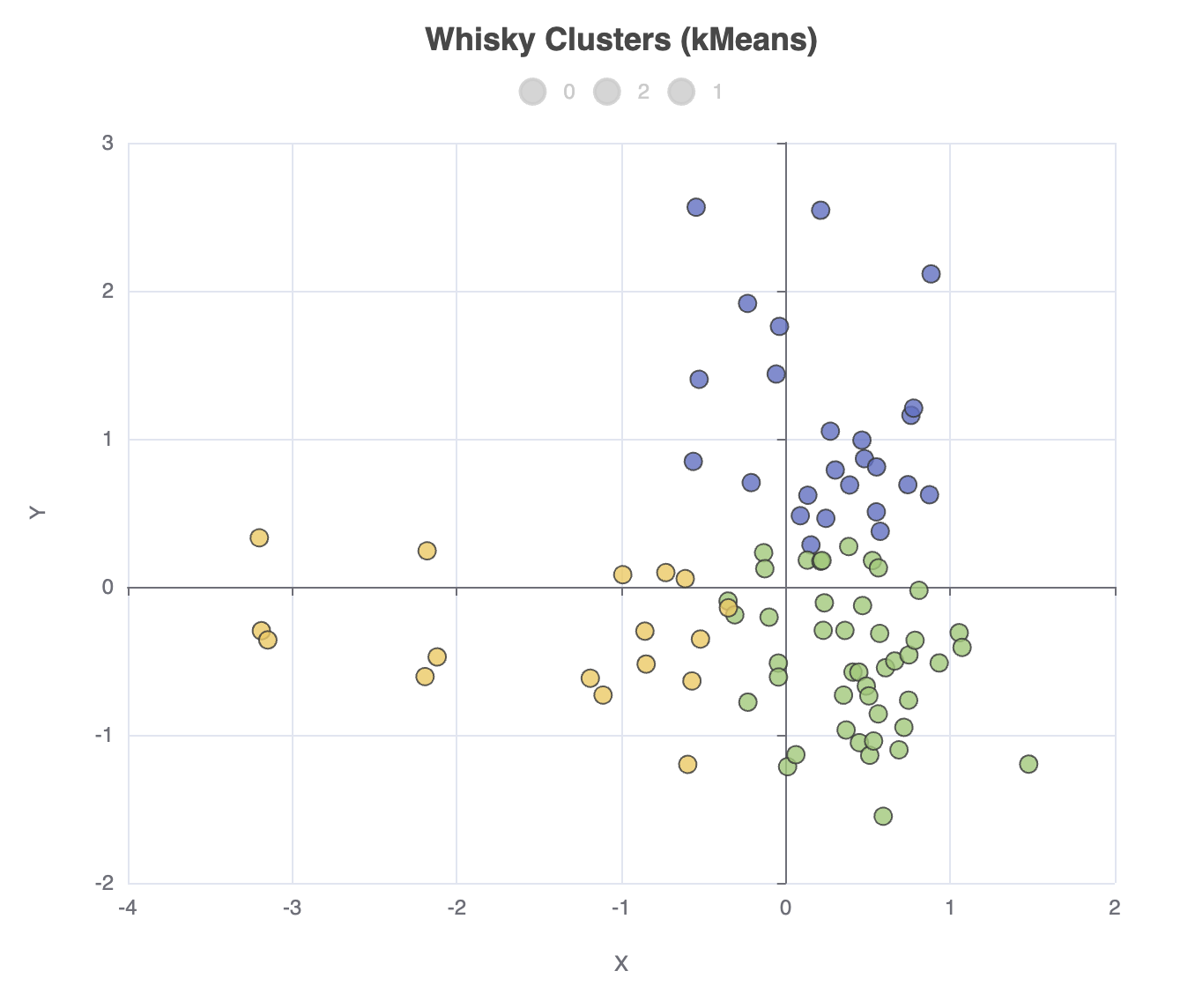
Let’s now cluster the distilleries using k-means, and place the cluster allocations back into the dataframe:
def ml = Underdog.ml()
def data = df[features] as double[][]
def clusters = ml.clustering.kMeans(data, nClusters: 3)
df['Cluster'] = clusters.toList()
Underdog offers some aggregation functions, so we can check the counts for the cluster allocation:
println df.agg([Distillery:'count'])
    .by('Cluster')
    .rename('Whisky Cluster Sizes')
Which has this output:
       Whisky Cluster Sizes
 Cluster  |  Count [Distillery]  |
----------------------------------
       0  |                  25  |
       2  |                  44  |
       1  |                  17  |
Or, we can easily print out the distilleries in each cluster:
println 'Clusters'
for (int i in clusters.toSet()) {
    println "$i:${df[df['Cluster'] == i]['Distillery'].join(', ')}"
}
Which gives the following output:
Clusters
0:Aberfeldy, Aberlour, Auchroisk, Balmenach, Belvenie, BenNevis, Benrinnes, Benromach, BlairAthol, Dailuaine, Dalmore, Edradour, GlenOrd, Glendronach, Glendullan, Glenfarclas, Glenlivet, Glenrothes, Glenturret, Knochando, Longmorn, Macallan, Mortlach, RoyalLochnagar, Strathisla
1:Ardbeg, Balblair, Bowmore, Bruichladdich, Caol Ila, Clynelish, GlenGarioch, GlenScotia, Highland Park, Isle of Jura, Lagavulin, Laphroig, Oban, OldPulteney, Springbank, Talisker, Teaninich
2:AnCnoc, Ardmore, ArranIsleOf, Auchentoshan, Aultmore, Benriach, Bladnoch, Bunnahabhain, Cardhu, Craigallechie, Craigganmore, Dalwhinnie, Deanston, Dufftown, GlenDeveronMacduff, GlenElgin, GlenGrant, GlenKeith, GlenMoray, GlenSpey, Glenallachie, Glenfiddich, Glengoyne, Glenkinchie, Glenlossie, Glenmorangie, Inchgower, Linkwood, Loch Lomond, Mannochmore, Miltonduff, OldFettercairn, RoyalBrackla, Scapa, Speyburn, Speyside, Strathmill, Tamdhu, Tamnavulin, Tobermory, Tomatin, Tomintoul, Tomore, Tullibardine
We might also be interested in the cluster centroids, i.e. the average flavor profiles for each cluster. Currently, Underdog uses Smile, under the covers, for clustering via K-Means. The Smile K-Means model already calculates the centroids but currently, that information is behind Underdog’s simplified K-Means abstraction.
Nevertheless, it isn’t hard to recalculate the centroids ourselves:
def summary = df
    .agg(features.collectEntries{ f -> [f, 'mean']})
    .by('Cluster')
    .sort_values(false, 'Cluster')
    .rename('Flavour Centroids')
We’ll take the results and do some minor formatting changes:
(summary.columns - 'Cluster').each { c ->
    summary[c] = summary[c](Double, Double) { it.round(3) }
}
println summary
Which has this output:
                                                                                                      Mean flavor by Cluster
 Cluster  |  Mean [Body]  |  Mean [Sweetness]  |  Mean [Smoky]  |  Mean [Medicinal]  |  Mean [Tobacco]  |  Mean [Honey]  |  Mean [Spicy]  |  Mean [Winey]  |  Mean [Nutty]  |  Mean [Malty]  |  Mean [Fruity]  |  Mean [Floral]  |
----------------------------------------------------------------------------------------------------------------------------------------------------------------------------------------------------------------------------------
       0  |         2.76  |              2.44  |          1.44  |              0.04  |               0  |          1.88  |          1.68  |          1.92  |          1.92  |          2.04  |           2.16  |           1.72  |
       1  |        2.529  |             1.647  |         2.765  |             2.118  |           0.294  |         0.647  |         1.647  |         0.588  |         1.353  |         1.412  |          1.353  |          0.941  |
       2  |          1.5  |             2.455  |         1.114  |             0.227  |           0.114  |         1.114  |         1.114  |         0.591  |          1.25  |         1.818  |          1.773  |          1.977  |
Looking at the centroids is one way to try to understand how the whiskies have been grouped. But, it’s very hard to visualize 12 dimensional data, so instead, let’s project our data onto 2 dimensions using PCA and store those projections back into the dataframe:
def pca = ml.features.pca(data, 2)
def projected = pca.apply(data)
df['X'] = projected*.getAt(0)
df['Y'] = projected*.getAt(1)
We can now create a scatter plot of this data as follows:
plot.scatter(
    df['X'],
    df['Y'],
    df['Cluster'],
    'Whisky Clusters (kMeans)'
).show()
The output looks like this:
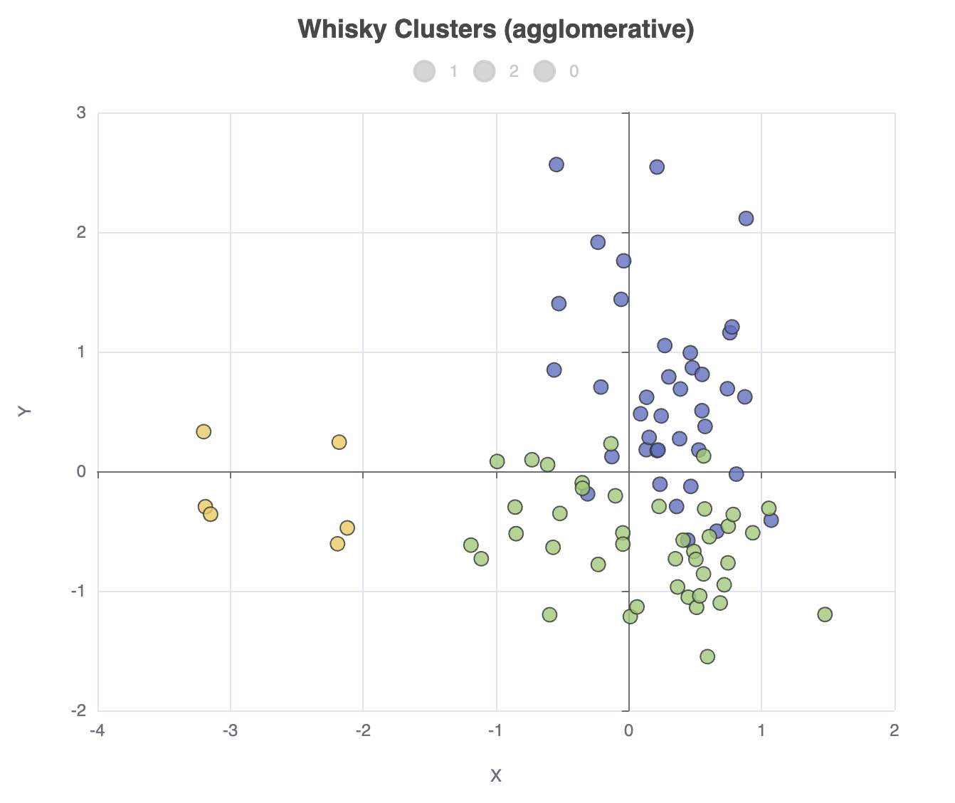
We can go and change our clustering algorithm, e.g. ml.clustering.agglomerative(data, nClusters: 3),
in which case the cluster allocation counts will look like this:
       Whisky Cluster Sizes
 Cluster  |  Count [Distillery]  |
----------------------------------
       1  |                  39  |
       2  |                  41  |
       0  |                   6  |
And the scatter plot looks like this:
A first look at Matrix
The Matrix library makes it easy to work with a matrix of tabular data. The Matrix project consists of the following modules: matrix-core, matrix-stats, matrix-datasets, matrix-spreadsheet, matrix-csv, matrix-json, matrix-xcharts, matrix-sql, matrix-parquet, matrix-bigquery, matrix-charts, and matrix-tablesaw.
While new, Matrix does build upon common JVM data science libraries, like Tablesaw and Apache Commons Math. For certain functionality, like clustering and dimension reduction, Matrix works well with libraries like Smile.
For a first intro, we’ll look at the matrix-core, matrix-stats, matrix-csv, and matrix-xchart modules.
Let’s read in our data, remove a column we don’t need, and explore its size:
def url = getClass().getResource('whisky.csv')
Matrix m = CsvImporter.importCsv(url).dropColumns('RowID')
println m.dimensions()
This outputs:
[observations:86, variables:13]
Currently, the data is all strings. Matrix provides a convert option for getting data
into the right type. It also has various normalization
methods. We want our data as numbers, and some of the functionality we’ll use, e.g.
the radar plot, assumes our data is normalized (values between 0 and 1).
Rather than using convert or the normalization methods, here we’ll show off the apply
functionality which will achieve the same thing for our example:
def features = m.columnNames() - 'Distillery'
def size = features.size()
features.each(feature -> m.apply(feature) { it.toDouble() / 4 })
Now, like we did with Underdog, we want to perform a query to find and display the whiskies which are somewhat fruity and somewhat sweet in flavor:
def selected = m.subset { it.Fruity > 0.5 && it.Sweetness > 0.5 }
println selected.dimensions()
println selected.head(10)
Which has this output:
[observations:6, variables:13]
Distillery  	Body	Sweetness	Smoky	Medicinal	Tobacco	Honey	Spicy	Winey	Nutty	Malty	Fruity	Floral
Aberlour    	0.75	     0.75	 0.25	      0.0	    0.0	  1.0	 0.75	  0.5	  0.5	 0.75	  0.75	   0.5
AnCnoc      	0.25	     0.75	  0.5	      0.0	    0.0	  0.5	  0.0	  0.0	  0.5	  0.5	  0.75	   0.5
Linkwood    	 0.5	     0.75	 0.25	      0.0	    0.0	 0.25	 0.25	  0.5	  0.0	 0.25	  0.75	   0.5
Macallan    	 1.0	     0.75	 0.25	      0.0	    0.0	  0.5	 0.25	  1.0	  0.5	  0.5	  0.75	  0.25
RoyalBrackla	 0.5	     0.75	  0.5	     0.25	   0.25	 0.25	  0.5	 0.25	  0.0	  0.5	  0.75	   0.5
Strathmill  	 0.5	     0.75	 0.25	      0.0	    0.0	  0.0	  0.5	  0.0	  0.5	 0.25	  0.75	   0.5
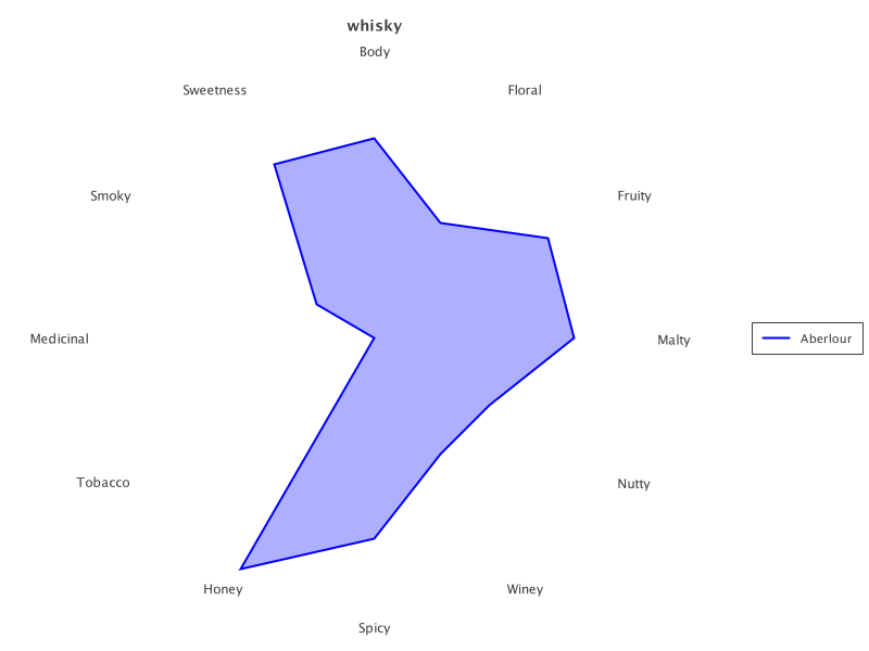
We can do a radar plot for just the first:
def transparency = 80
def aberlour = selected.subset(0..0)
def rc = RadarChart.create(aberlour).addSeries('Distillery', transparency)
new SwingWrapper(rc.exportSwing().chart).displayChart()|
Note
|
If matrix-xchart doesn’t have the functionality you are after, considering
looking at the matrix-chart library. They offer many similar charts but there
are some differences too.
|
The output looks like this:
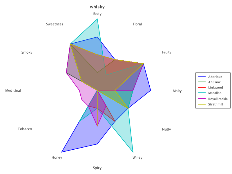
The same chart also works to display all selected whiskies:
rc = RadarChart.create(selected).addSeries('Distillery', transparency)
new SwingWrapper(rc.exportSwing().chart).displayChart()
Which looks like this:
Let’s now cluster our whiskies. We’ll use the K-Means functionality from Smile. Let’s apply K-Means, and place the allocated clusters back into the matrix:
def iterations = 20
def data = m.selectColumns(*features) as double[][]
def model = KMeans.fit(data, 3, iterations)
m['Cluster'] = model.group().toList()
We can examine the cluster allocation using groovy-ginq functionality, which works well with Matrix:
def result = GQ {
    from w in m
    groupby w.Cluster
    orderby w.Cluster
    select w.Cluster, count(w.Cluster) as Count
}
println result
Which has this output:
+---------+-------+
| Cluster | Count |
+---------+-------+
| 0       | 51    |
| 1       | 23    |
| 2       | 12    |
+---------+-------+
We can convert the ginq result back into a matrix like this:
println Matrix.builder('Cluster allocation').ginqResult(result).build().content()Which has this output:
Cluster allocation: 3 obs * 2 variables
Cluster	Count
      0	   51
      1	   23
      2	   12
For the particular problem of checking cluster allocation, we can also use the normal Groovy extension methods:
assert m.rows().countBy{ it.Cluster } == [0:51, 1:23, 2:12]The cluster centroids, i.e. the average flavor profiles for each cluster. These are available from the Smile model (we’ll denormalize the values by multiplying by 4, and then pretty print them to 3 decimal places):
println 'Cluster ' + features.join(' ')
model.centers().eachWithIndex { c, i ->
    println "   $i:   ${c*.multiply(4).collect('%.3f'::formatted).join('  ')}"
}
Which has this output:
Cluster Body Sweetness Smoky Medicinal Tobacco Honey Spicy Winey Nutty Malty Fruity Floral
   0:   1.569  2.392  1.235  0.294  0.098  1.098  1.255  0.608  1.235  1.745  1.784  1.961
   1:   2.783  2.435  1.478  0.043  0.000  1.913  1.652  2.000  1.957  2.087  2.174  1.696
   2:   2.833  1.583  2.917  2.583  0.417  0.583  1.417  0.583  1.500  1.500  1.167  0.583
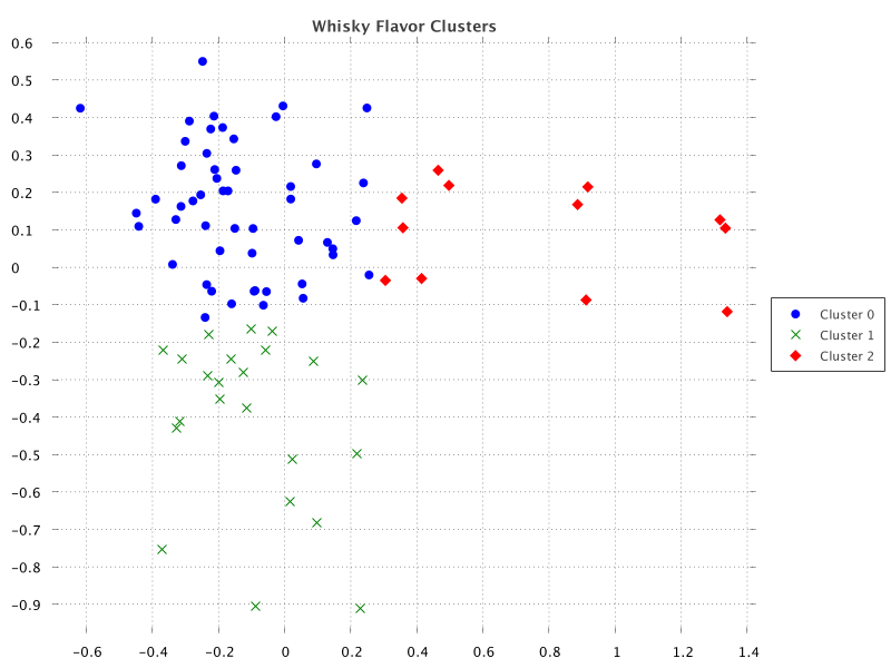
We can also project onto two dimensions using Principal Component Analysis (PCA). We’ll again use the Smile functionality for this. Let’s project onto 2 dimensions and place the projected coordinates back into the matrix:
def pca = PCA.fit(data)
def projected = pca.getProjection(2).apply(data)
m['X'] = projected*.getAt(0)
m['Y'] = projected*.getAt(1)
Let’s now create a scatter plot showing the distilleries mapped according
to the projected coordinates. The most compact form of the ScatterPlot#create
method assumes one series, but it’s not hard to add each series ourselves:
def clusters = m['Cluster'].toSet()
def sc = ScatterChart.create(m)
sc.title = 'Whisky Flavor Clusters'
for (i in clusters) {
    def series = m.subset('Cluster', i)
    sc.addSeries("Cluster $i", series.column('X'), series.column('Y'))
}
new SwingWrapper(sc.exportSwing().chart).displayChart()
When run, we get the following output:
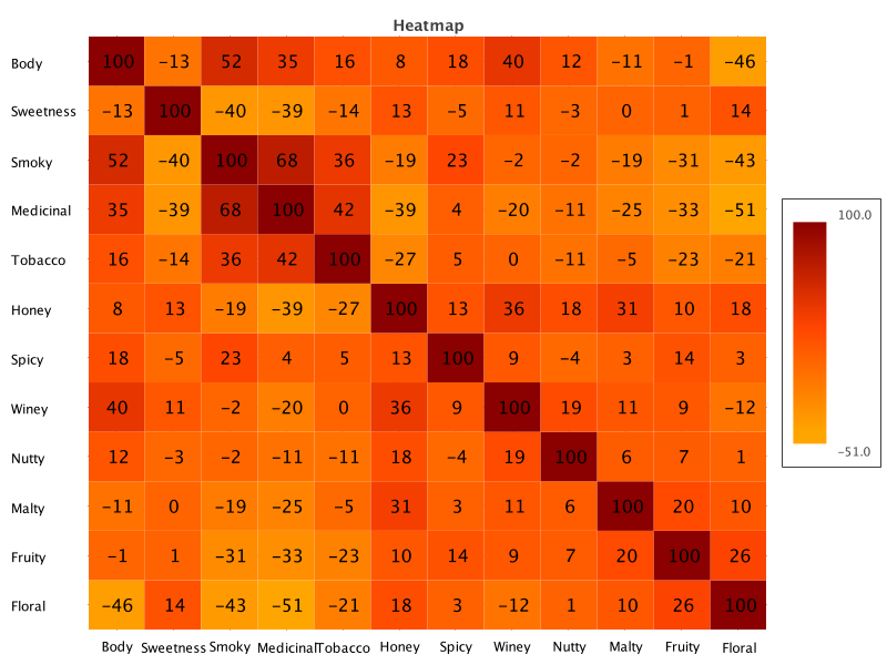
Matrix doesn’t have a correlation heatmap plot out of the box, but it does have heatmap plots, and it does have correlation functionality. It’s easy enough to roll our own:
def corr = [size<..0, 0..<size].combinations().collect { i, j ->
    Correlation.cor(data*.getAt(j), data*.getAt(i)).round(2)
}

def corrMatrix = Matrix.builder().data(X: 0..<corr.size(), Heat: corr)
    .types([Number] * 2)
    .matrixName('Heatmap')
    .build()

def hc = HeatmapChart.create(corrMatrix)
    .addSeries('Heat Series', features.reverse(), features,
        corrMatrix.column('Heat').collate(size))
Which has this output:
Further information
Conclusion
We have looked at how to use Underdog and Matrix to classify whisky flavor profiles.